ShopDreamUp AI ArtDreamUp
Deviation Actions

Printable Holiday cards
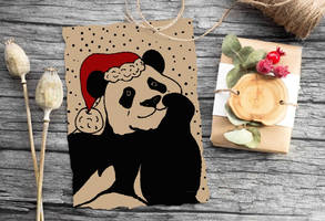
Printable cards (for example Christmas cards) made with digital goop pen. Just print and write text.
Large size (over 3000px) JPG with background , PNG without background.
For personal use.
$1/month
Suggested Deviants
Suggested Collections
You Might Like…
Description
I was really bored and I looked at my fellowship's website... It was kinda dull, so I thought Hey, why don't I design something, even if it's just for fun. Besides, I need to fill my portfolio with stuff, right?
I drew some inspiration from the abstract expressionism artist Jackson Pollock. I decided to look for crazy brushes to use and go all "action painting" on some of the layout. If you are looking for the brushes I used for the site, go to my favorites. They are all there.
I spent about 8 hours (I took breaks in between, of course) designing the homepage. It's 10:30 am, do the math to know when I started.
<strike>This is not the final version but it's pretty close to it.</strike> I would really appreciate some constructive criticism, please!
EDIT:
Major changes to the design! I took advantage of the fact that the eye rests on the left side of an image. I shifted the picture and the [thumbnail version] calendar to the left. I also added a "Upcoming Events" section in there.
I also added another color to the site because I thought that only white, gray and black were kinda bland. Besides, it can't be a James Design without my signature "red & black", right?
*I haven't slept in almost 48 hours...*
Image size
1200x1500px 544.77 KB
© 2009 - 2024 Ariarin
Comments12
Join the community to add your comment. Already a deviant? Log In
Very nice! I really like the grungy feel to it and how you used the brushes splattering the border. I see on the bottom right that you used a white brush that goes into the black, I really like that and maybe you should add a couple spots of that. The overall layout is straight forward and easy to navigate for users which is always a plus.
However, the only thing that bugs me about your layout is circle on the top left which stands out and doesn't seem to go along with your sharp black, red and white theme. As neutral as grey is, I think that the circle should be white and have some more edgy design to it (maybe more brushes, make it a different shape etc.) because it looks really simple in comparison to the rest of the layout.
Hope my critique helps?


